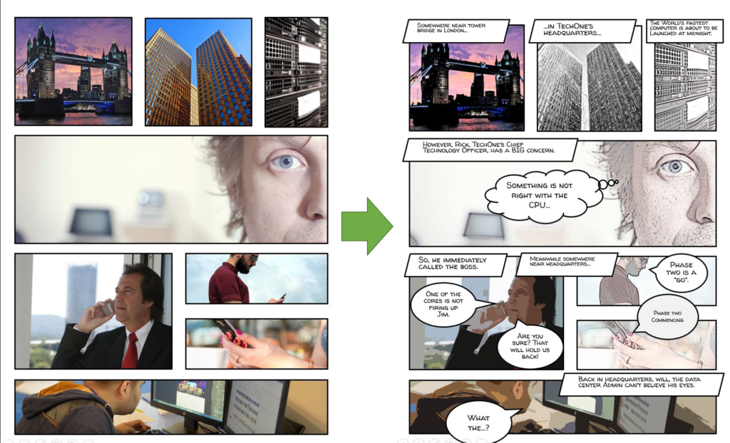
I’m currently developing a project which applies a visual treatment in the style of a graphic novel. Graphic novels is what most people simply call “comics” today. To some, they are not entirely the same, but their commonality lies in the practice of visual storytelling. There’s a long and interesting history about graphic novels and if you would like to know more, check it out the works of Will Eisner. However, this post is about how you can use the regular images and modify them with PowerPoint to quickly develop a graphic novel storyboard for eLearning.
Why PowerPoint?
PowerPoint is a versatile multimedia design and editing tool, not just presentation software. At least that’s how I use it. I often go to PowerPoint when I want to quickly put together a sample or event edit an image for a website. Many people don’t know that PowerPoint packs many similar features found in the Adobe Creative Suite products. For example, it offers vector shape drawing, screencasting, basic video and audio editing. So, if you already have it as part of your Office bundle of products, why not use it for quick prototyping?
The Project
The project at hand is a cyber security module to prevent and reduce security violations as well as promote best practices. Ultimately, this project would be presented to learners as an eLearning module developed in Articulate Storyline 360. However, this is a bit of a departure from the traditional content delivery model as the graphic novel format forces you to incorporate visual storytelling. A story makes it more compelling as characters and real life situations can converge in a natural flow just like most of us experience watching movies.
The Workflow
The workflow of building this graphic novel sample is fairly easy in PowerPoint and hopefully you are using the 2013 version and above. The main point is to make average images look like they were drawn comic book style.

Step 1- Set the Slide Size
This is entirely your choice. I chose to go to the Design tab and change the Slide Size to Legal Paper to give me a portrait orientation similar to comic books. You can follow these instructions.
Step 2- Slide Master Layouts
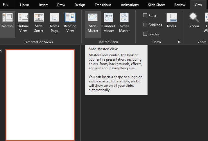
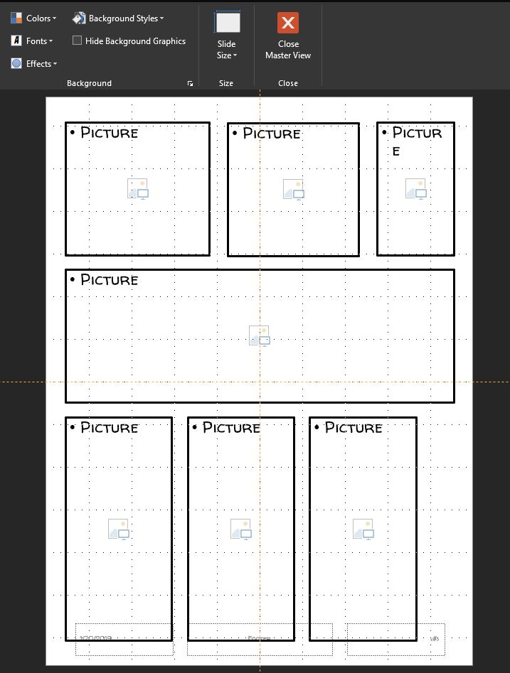
We need to create layouts that mimic a comic strip look. Instead of working directly on the first slide, we can create the layouts in the Slide Master so they are always available for future projects. Open PowerPoint, save your file and go to View>Slide Master. You should be able to see the Slide Master and all the default layouts right below. By right-clicking a layout you can rename it or create a new one.

Step 3- Insert Picture Placeholders
Now that we are in the Blank master layout, click on Insert Placeholder and select the Picture placeholder. I formatted mine with a 3pt black border to give the comic strip block look. Once you are happy with the position and look of your first block, select it and press Ctrl+D to duplicate and set up the rest of the layout. Then, click Close Master View under the Slide Master tab.

Step 4 – Insert Images
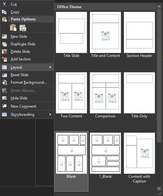
After you closed the Slide Master, you should see just one blank slide in your slide panel. Right-click the slide and select the Blank layout to apply it to the slide. Now we are ready for the easiest and hardest part. It’s the easiest because, all we need to do is click on the top left block and insert an image. The hardest part is which image we would use. My recommendations are to find some digital sample of graphic novels if writing is not your forte. Otherwise, think of the camera shots and sequence of images you would see in a movie or your favorite Netflix show.

Step 5- Apply Artistic Effects
The last thing to do is to apply the desired “drawing-like” look on the images by clicking each one and selecting Artistic Effects under the Format tab. Here’s a video that breaks it down succinctly.
Last Thoughts
Alright, there you have it, nice and easy stuff in PowerPoint that makes regular images look more engaging. Add a good story and the sequential art as our friend Will Eisner did and the magic just happens. For other great ideas in applying this concept, check out some of my creative friends:
