ELearning Heroes Challenge #100 is here and it’s all about “Before and After” visual comparisons and contrasts. By the looks of it, we might get 100 responses to the 100th challenge! In this post, I cover a bit of the method behind two slider samples I built for the challenge. The first slider sample was a comparison of Disney’s TomorrowLand images from the 70s and a now. The second shows aging on a model using transparencies in multiple image states and slider based triggers. Here’s the how-to in case you would like to try it in Storyline2.
The Ingredients
Storyline2 (key ingredient ; )
3 images
10 states per image
1 slider with at least 10 positions
10 triggers per image (at least two of the images in the set)
The Prep Work
- Select one image as your “base” image. Technically you won’t do anything to this image. In my sample if the young lady on the left.
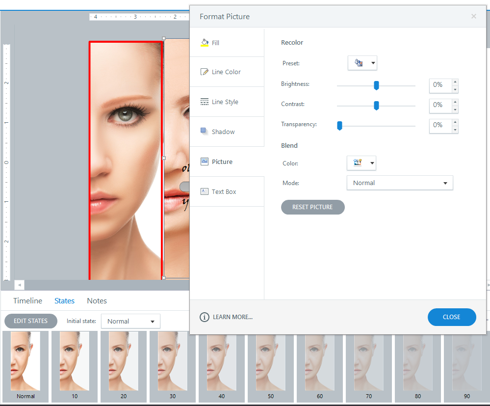
- Select one of the other images and create 10 states each with a 10 degree variation in transparency from 90% to 10%. Just right-click the image, Format Picture and adjust transparency.
After that all you would need to do is use the Format Painter to copy the formatting from this image to the third image in use. In my sample, is the aged face on the lady.
Slider and Triggers
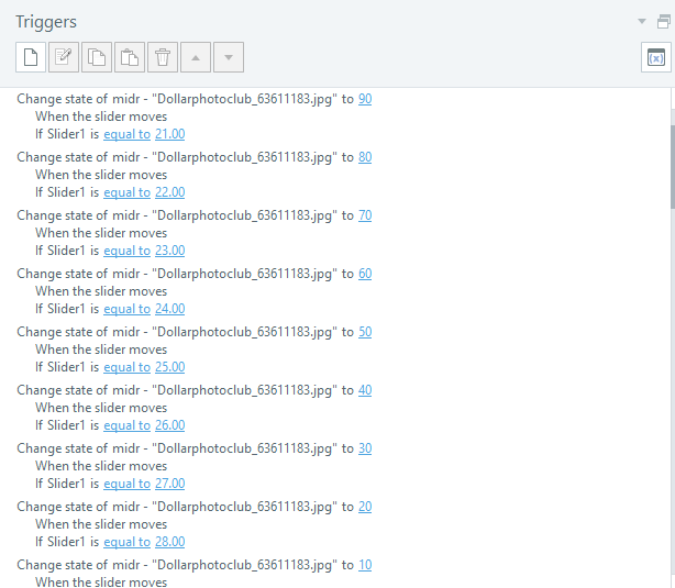
The number of steps or “stops” on the slider really depend on your preference and how smooth or abrupt you want the transition to look. In this sample, I used 40 steps and the slider starts at position 20. So, the plan is that if you go left towards the ZERO mark, the left image goes from Young to Old and vice versa if you go towards the right or the FORTY mark. Each step gets a trigger that changes the transparency gradually on the selected images.
Finished Sample
The sample is embedded below so you can check it out.


