This week’s Elearning Heroes Challenge #114 highlights the use of zooming and magnification of images with Storyline2 (SL2). I put together a sample which shows an image of London which allows the user to zoom into specific sections for a closer look of the city. The “Zoom Region” feature in SL2 makes the creation of this effect a simple process. Why use it? Well, a well timed zoom can enhanced the focus of the learner to a specific section of a course or any other visual aid. In this post, I cover three cases in which I found zooming to be effective and some creative ways to use it.
Zooming to Guide Focus
The obvious use of zooming is to take a closer look. In the sample I created about London, the main purpose is just that. The click on the image below to view how I built it.
Software Simulations
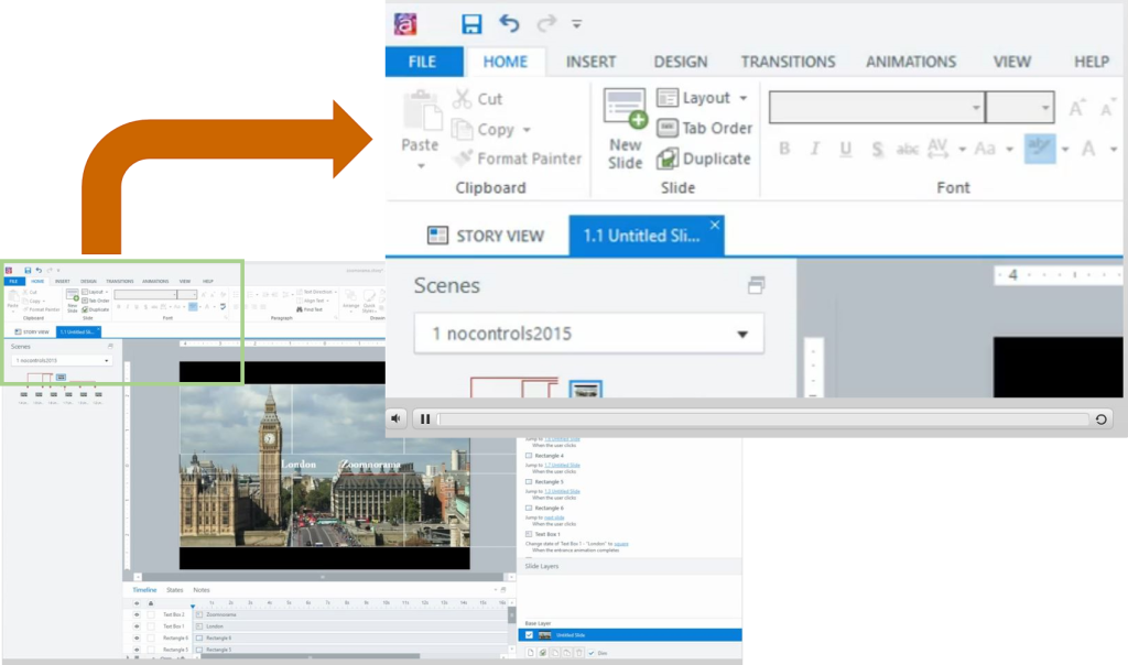
A second strong case for the use of zooming regions is highlighting specific areas of the screen to point out features in software training simulations. This can work great when the zooming regions are synced with the audio and screen captures. For example, the image below shows how the zooming region is used to emphasize the focus on the menu ribbon.

Powerful Zooming Transitions
Another great application of zooming regions for me has been during slide transitions. It can create a panning movement that keeps users engaged or again augments the learner’s focus on a specific region of the screen. In the sample below, the Elearning Legends Episode on Atsumi demonstrates zooming transitions between slides to create a dynamic and engaging effect.
Conclusion
In this post we explored three strong cases for the use of zooming effects in Storyline2 projects. The three examples given here demonstrate how learners can be effectively engaged by focusing their attention with the use of zooming regions. If you are creating software simulations, the use of zooming regions can be very helpful to point out key areas of the software screen. Adding zooming regions for transitions between slides can create an engaging effect to bring in new slides. I hope this is helpful for you whether you are just beginning in elearning or you would like to further your SL2 skills.


