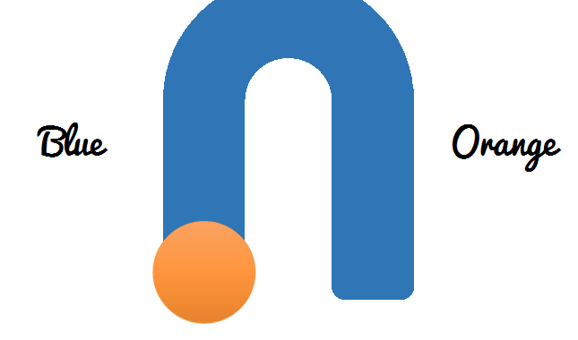
I always enjoy a good ELH Challenge and this week’s challenge #97 offers some great creative concepts for interactive buttons. My submission concept can be described as an animated switch. The interaction happens when the user clicks a round button; then, the button switches from one side of the screen to another on a “U” shaped path. At first, I just designed the interaction so the button moved from side to side hiding\revealing a text box indicating whether the button was on the left or right side. However, my creative sparks flew off and I thought of a change of color which would follow the button’s path. See the sample by clicking HERE
The Recipe
The following items is roughly what you would need to create this interaction:
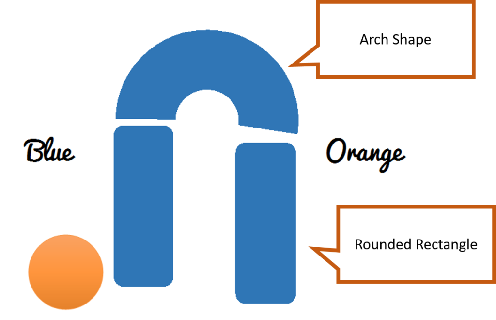
- Two Rounded Rectangle Shapes
- One Arch Shape
- One Circle Shape
- Two Text Boxes
- Two Layers
- One variable
Step One- Insert Shapes, Textboxes and Align Them
The hardest part (believe it or not) was aligning all the shapes so they would look as one.
Step Two- Create Layer for Path Animation
Create the layer and copy the circle shape on it.
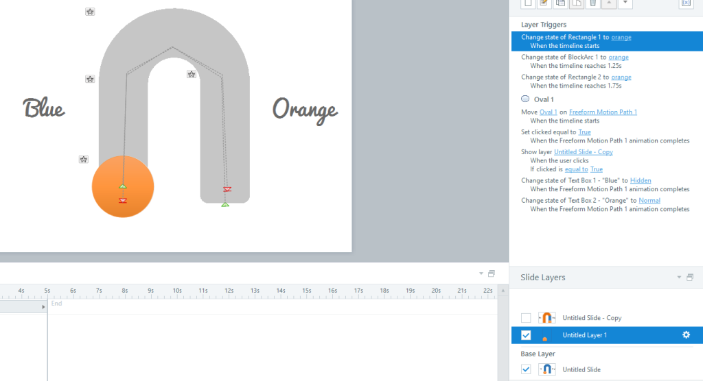
The purpose of this layer is to display the animation path of the circle once is clicked. This is beneficial because it allows you set the animation path from the start of the timeline on the layer. Of course we would have to set a trigger on the base layer to hide the shape once clicked. This layer would also change the STATES of the path shapes on the base layer .
Animation Path for Button
The circle shape is our button and once is clicked it will be sent from left to right following a Freeform Animation path as the one seen below. You may also want a second animation path doing the exact opposite.
Step Three- Animated States
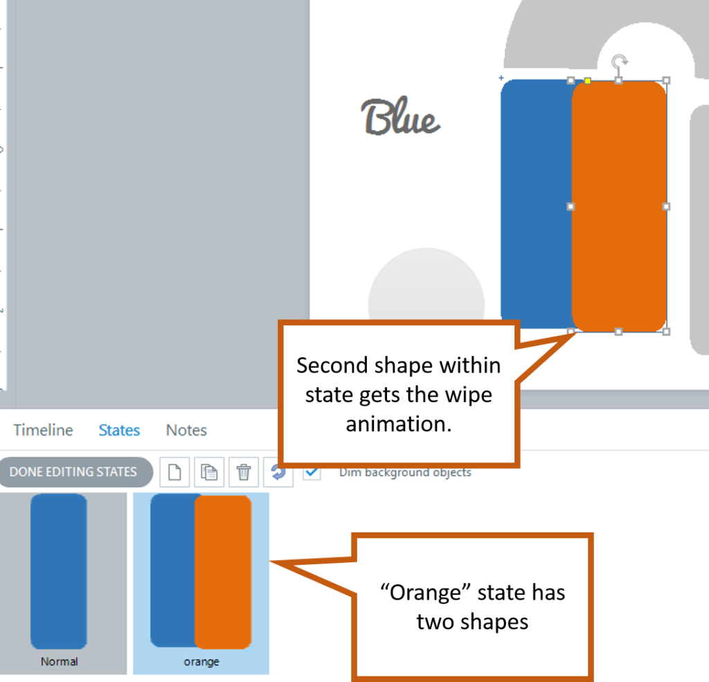
This is the main “trick” of the illusion and\or interaction. In the sample, you see an orange path follow the button from left-to-right. How can we do that? Easily, duplicate the normal state on each of the shapes and then duplicate the actual shape in the new state so one masks the other. This allows you to add an animation to the masking shape making it look like it’s wiping the color off the original state.
Step Four- Set Your Triggers
As you already know, nothing happens in Storyline without triggers. So, here’s a recount by layer.
Base Layer
Here we just want to hide the circle shape and show the animation layer once the circle shape is clicked.
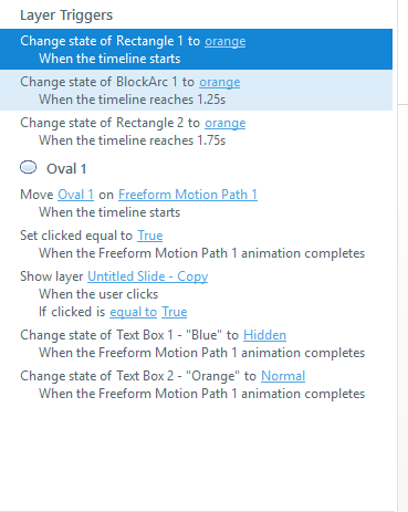
Animation Layer
Below are the animation layer triggers and their timings:
By the way, at this point you want to create the “Clicked” variable which is a True\False one. The variable changes to “True” at the end of Animation Path 1 and back to “False” at the end of Animation Path 2.
After you have created all the triggers (except for the Show Layer one), you can go ahead and duplicate the base layer to prepare the “Orange-to-Blue” phase of the interaction. That is when the user clicks on the circle shape and the “Clicked” variable equals “True” the shape would go onto Animation Path 2 and you would change the animated states of the shapes correspondingly.
Alright, that’s it for now ; ) You can download the story file below so you can dissect all the blabber I wrote above!


Well done Sir! Very creative!
Thank you Jeff, I appreciated your feedback very much.
Hi Alexander,
your site is very useful and it has a lot of nice tips about building Elearning courses.
I’m glad to have found you 🙂
Thank you Kya, I love your site as well. Noi siamo Disenadores Instruzionali (and that’s what I call murdering a language ; )
Thanks Alexander 🙂
Did you understand anything on my site? 😀 I should write in english as well, but for now it takes too much time and my English is not so good…
Yes, I understand most of it. I took basic and intermediate Italian in college and I also speak Spanish.
Great! 🙂