A couple of days ago I wrote a post on LinkedIn titled "3 Ways to Develop Better Presentations". Today I offer a follow up with three more "hidden treasure" techniques in PowerPoint for my fellow trainers and presenters who want to sharpen their design skills.
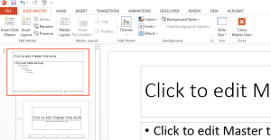
Do you find yourself always "building" PowerPoints from scratch? Do you create one slide with the look and feel you want and then duplicate it multiple times? What about if you want a title slide to look different from a question slide? By creating your own Slide Master you can save a TON of time and not have to repeat the aforementioned processes over and over. To create a slide master just go to VIEW>SLIDE MASTER. From there you can control a slide's layout, font size, color , background color and place logos. You do this so every time a new slide is created it would be already formatted the way you want it.
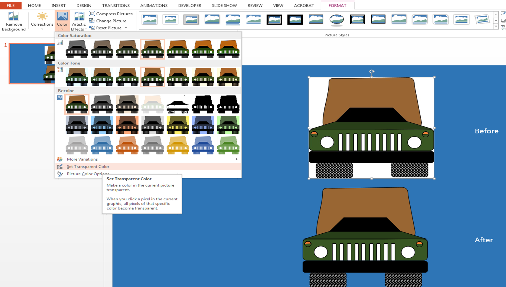
You have a blue background (with no option for changing it) and you wish your image background could just blend with your slide background. No problem, if your image has a one-color background; then, you can SELECT the image, click the FORMAT tab and under COLOR select "SET TRANSPARENT COLOR". After these actions your cursor turns into a wand or pencil and you can click away the background color.
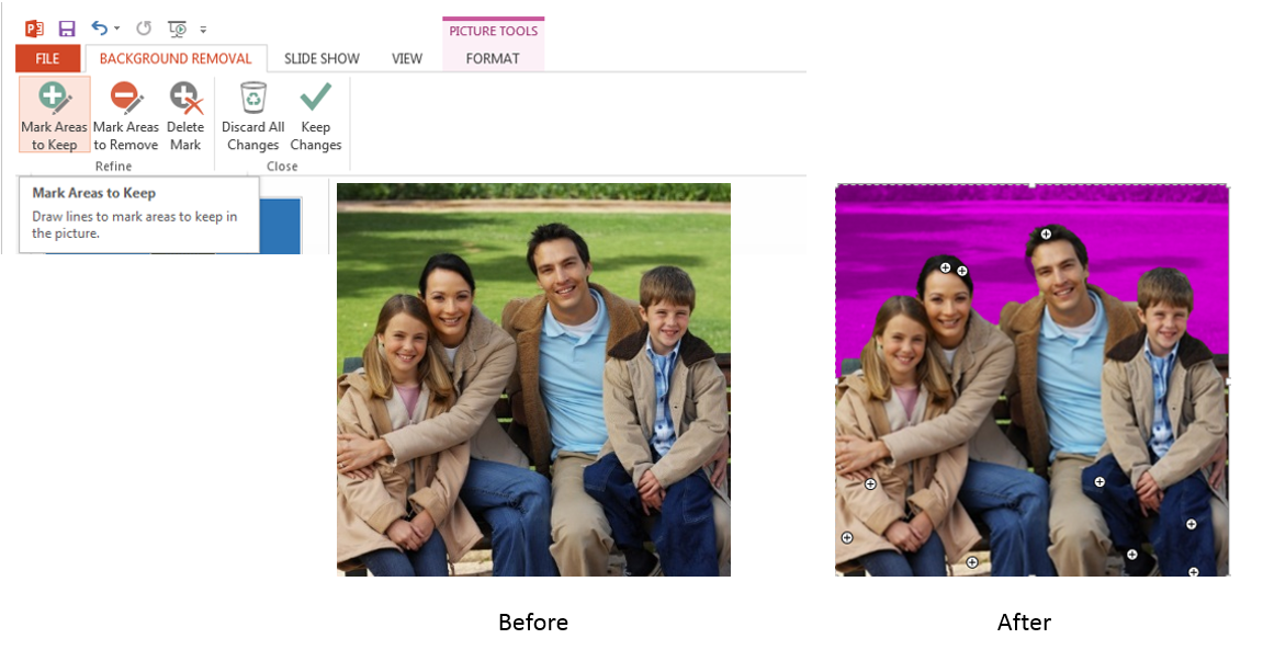
If your background has multiple colors, then you would SELECT the image go to the FORMAT tab and click REMOVE BACKGROUND. This would put the image in editing mode where PowerPoint would highlight the areas to be removed with a pinkish hue. You can use the controls "Mark Areas to Keep" and "Mark Areas to Remove" as necessary and then click KEEP CHANGES to remove the background.
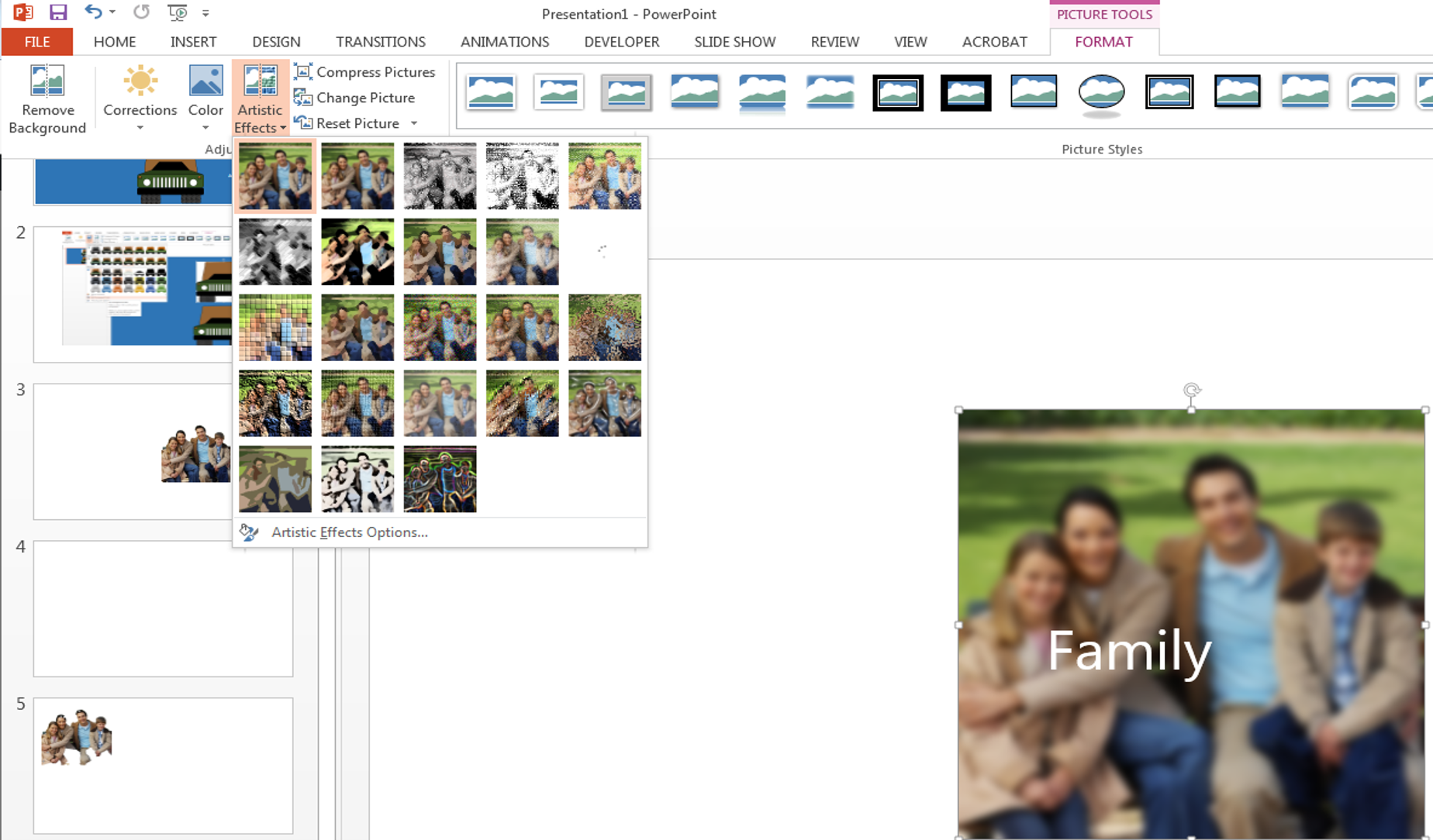
There are many artistic effects that you can use to increase the FOCUS of a message on your slides. To apply artistic effect SELECT the image and FORMAT>ARTISTIC EFFECTS and select your favorite one. A good one to use is the BLUR effect which blurs the image bringing all the FOCUS to the foreground. In the example below, you can notice how by blurring the image the word "Family" gains more visibility and context.


