One of Articulate Storyline2's feature is the slider interaction. The slider is a powerful interaction because you can give the learner real-time outcomes based on the position (step) he or she drags the slider button to. Although you can simulate slider interactions in other authoring tools (usually installing external widgets), nothing compares to the ease-of-use and several creative uses the StoryLine2 offers out-of-the-box. On this post, StyleLearn gives you a quick overview on the slider interaction and 3 different ways to use it.
Slider Overview
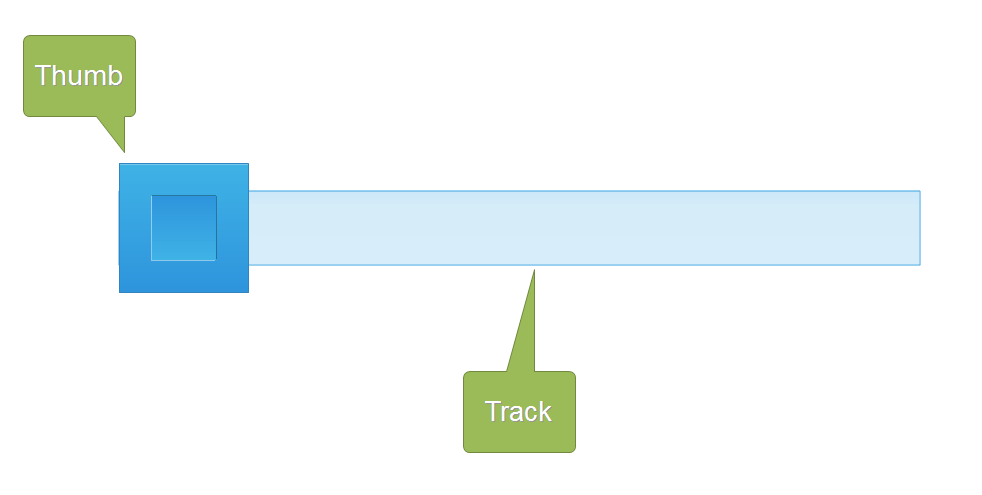
The slider interaction consists of a thumb (button) and a track. The button is drag by the user from left-to-right or vice versa (which also depends on the orientation of the slider i.e. vertical vs horizontal). The track is a straight path the thumb can be dragged or slid on. Both of these elements have formatting properties that allow you to change their color and look as needed.
The Standard Slider
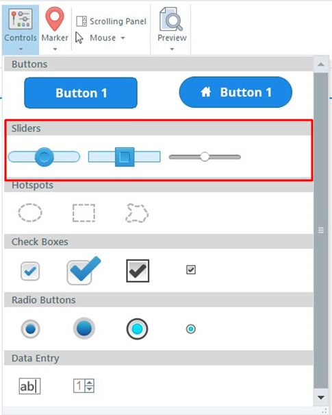
The most basic form of the slider in SL2 is the standard or default slider. There are three versions of standard sliders when you click on the Insert tab and click on "Controls" as seen below.
The Image Slider
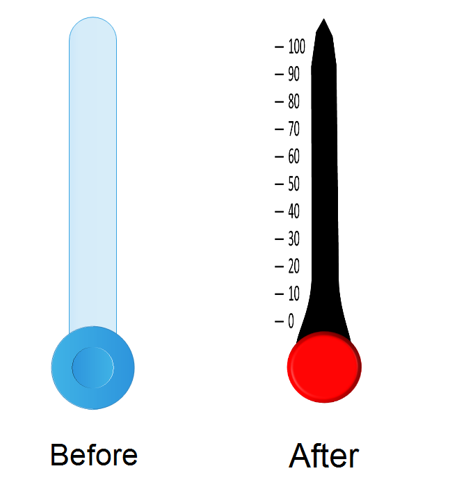
As previously mentioned, a slider thumb and its track formatting properties can be changed; that means the thumb and track can be filled with a different color or an image. An image slider is a slider that has its thumb andor track filled with an image. This can be really helpful in creating a more engaging interaction as seen below. The left image shows the default slider while the right shows an image slider where both the thumb and track have been replaced with images.
The invisible slider
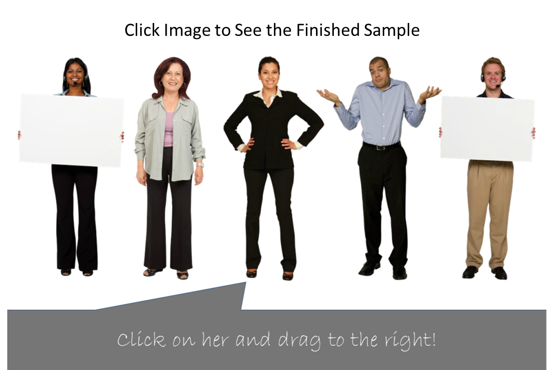
Thanks for the formatting properties on the thumb and track, elearning developers can create highly engaging slider interactions which do not look like a slider. This is done by formatting both the thumb and track to have no color or outline fill. What remains is the functionality of a slider without the look of it. This can be helpful to create side-to-side swiping motions for mobile devices. In the image below, you see the slider in place prior to removing the fill and outline colors. In this case the user will be able to swipe right to move all characters to the right and out of the screen.

